 LUSITOr
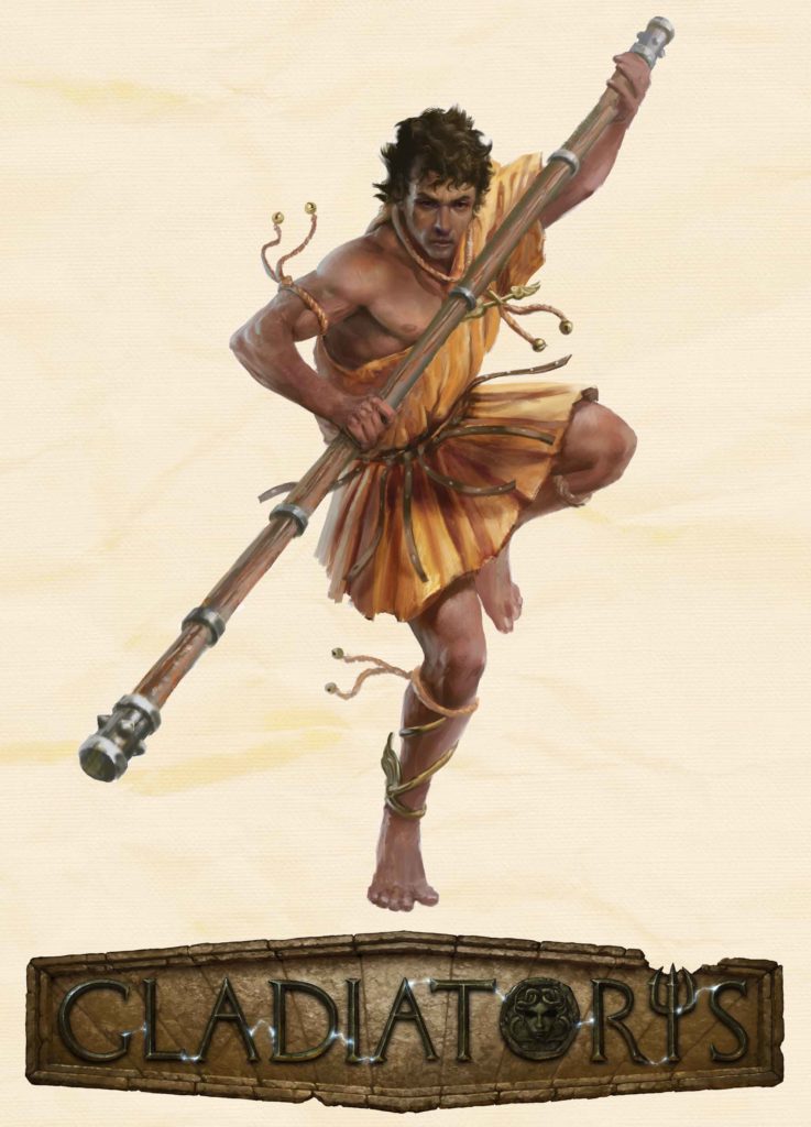
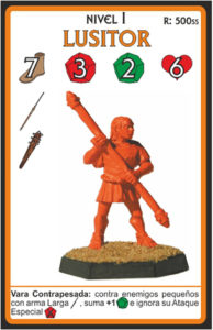
The most popular Acrobat jumps into the Arena without any shield or any kind of protection, only with his great agility and superb reflexes. Wearing a simple tunic, he is armed with a reinforced staff; with it, he can thwart his opponents’ attacks and knock them down by surprise. His characteristics make him the favourite of many lanistae.
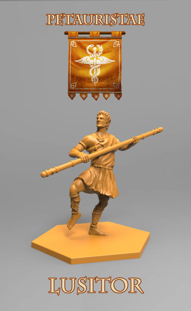
At Level III, he can attack with a Sweep and knock down an opponent (except for large ones) that will be unable to prevent it in any way. His special defense, Disarray, is simply amazing: he gains +1 Block and, after attacking, his enemy is knocked down (except Beasts). This way, he can send floor his rival in their own turn! Also, his Reinforced Staff always gives him +1 Defense Die against small enemies with Long weapons, and he can even ignore their special attacks!
Excerpt from the glossary of GLADIATORIS, checked by Alfonso Mañas.
design process
This fighter’s story is a curious one: in our first prototype, the yellow Hunters were the fourth basic team… and the Acrobats were a kind of “cheerleader squad” with harmless weapons (sticks and whips), destined to a future expansion.
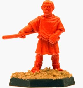
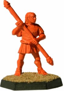 That gladiator was the Counter-retiarius; armed with a reinforced staff (a blunt weapon that raises the Defense of the enemy instead of lowering it), he showed an outstanding ability dodging attacks, avoiding dangers and, above all, forcing his enemies to step back (he always had the Maeuver Card “Back off!” up his sleeve). His staff, the contraiaculum and designed to avoid the net-and-trident attacks of his usual adversary, began a reign of terror amongst the true gladiators.”
Excerpt from the old blog of Gladiatoris.
Of course, Gladiatoris is not exactly a historical recreation, but a fun boardgame. And, as we care a lot for our “formerly known as Contraretiarus” gladiator, we kept him without almost any change and (with what seems a wink to his godfather, Luis) re-batptized him as Lusitor (equivalent to the old lusiarius, a gladiator that fights with a lusoria weapon, a bloodless one).”
Excerpt from the old blog of Gladiatoris.
Alfonso: “I like the name Lusitor as homage to Luis (that’s good, you’re great!) I didn’t know he liked the contraretiarius that much.”
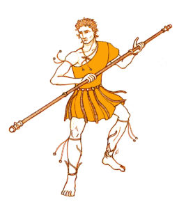
In our first sketch, we dressed him with a toga and added ribbons and ropes with bells as Acrobat traits (jester and comedians), as well as the little wings from their banner at his ankles. Luis found “his” gladiator a little muscleless…
Alfonso: “The sketch looks good, there’s nothing unaccurate or that doesn’t sound right according to the few sources we have on them (…). Taking into account that they were acrobats, they couldn’t have been too muscled.”
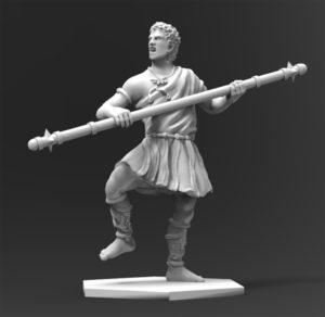 Our first 3Ds (after the usual stance testing) were quite correct. This time it was Luis who led the corrections.
Luis: “I think the staff’s size and thickness is fine, but the spikes don’t really strike me as correct: we have to take them out. The Acrobats’ weapons are simple staves, without spikes; it could have half-spheres as in David’s sketch, but I prefer nothing in their place.
The leg’s defenses are too thick… they look like greaves. We have to trim them down.
The face’s look is too violent, it should be more thoughtful, Shaolin-monk style. No wrath. This team is the most serene one, they need more concentration to have any advantage on the Arena.
The stance is too much vertical in respect to the left leg. In our stance tests, he was “unbalanced” to the left, as if gathering momentum. That could be right. Or he could be unbalanced to the right, as if just before attacking.”
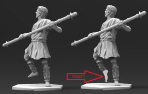 Alfonso: “I agree. I would also add that, by the postition of his legs and feet, he looks like dancing to me. To avoid this, we should design a more biomechanically realistic stance in respect to his feet-in-the-air momentum-gathering gesture.”
 David: “Finally, you have designed all the staff reinforcements as cilinders, when they should be rounded, like toroids, as if they were rings stuffed into the wood instead of bent metal bands. To this purpose, I’m sending you the little sketch I drew when we remodeled the banners (the Acrobats’ one was the rightmost one).”
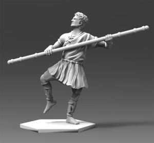
Once finished, we all loved it. It was a very fun mini to play with, hitting other minis with his little staff 🙂 Then, our wonderful illustrator came in.
A. J. Manzanedo: “Hi again. This acrobat character is very interesting. He’s slim but strong and his stance is dynamic. OK, let’s work. :)”
[slideshow_deploy id=’1496′]
 David: “I reaaally love the way you draw coloured sketches instead of penciled ones… When we publish the design process, everyone is going to be amazed at your quick sketches.
That said, it worries us, when thinking of stuffing it inside the fighter card (look at the prototype’s), that he’s too long on the vertical axis. We should make the staff a little longer downside and a little shorter upside, or hunching him a little, as you think it’s best.”
We chose the most encroached stance, and Manzanedo gave us a pleasant surprise… but the “spikes” were back. 😀
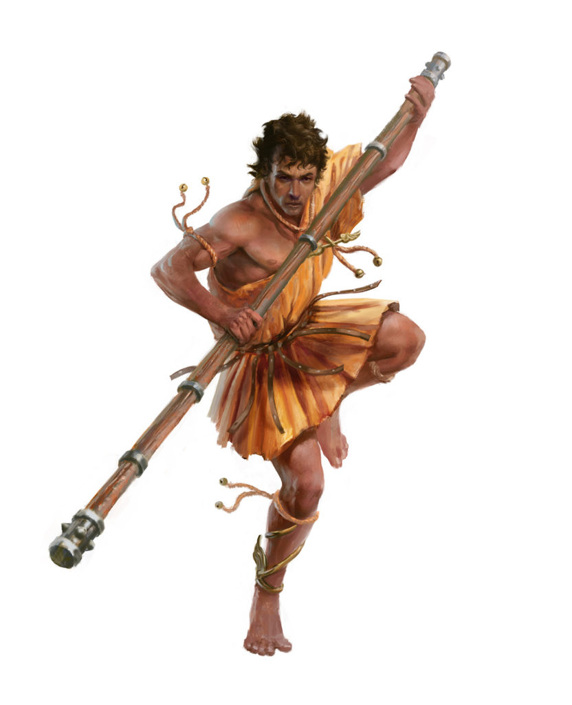 Alfonso Mañas: “Genius. Congratulate the artist.”
Luis: “The spikes are not bad, they look like Roman thumbtacks.”
So in the end… we left the spikes. At the start, Luis didn’t like them because they were pointed, not blunt (it is, after all, a Blunt weapon under the game’s rules).
Should we have themm back in the miniature, to reflect the illustration?
3DBreed: “No problem. We’ll put blunt “spikes/thumbtacks” as per the illustration. Congrats, Antonio, it’s spectacular!“
David: “At last my archenemy is here! ;)”
[slideshow_deploy id=’1497′]

